Donation Form Tributes
Context
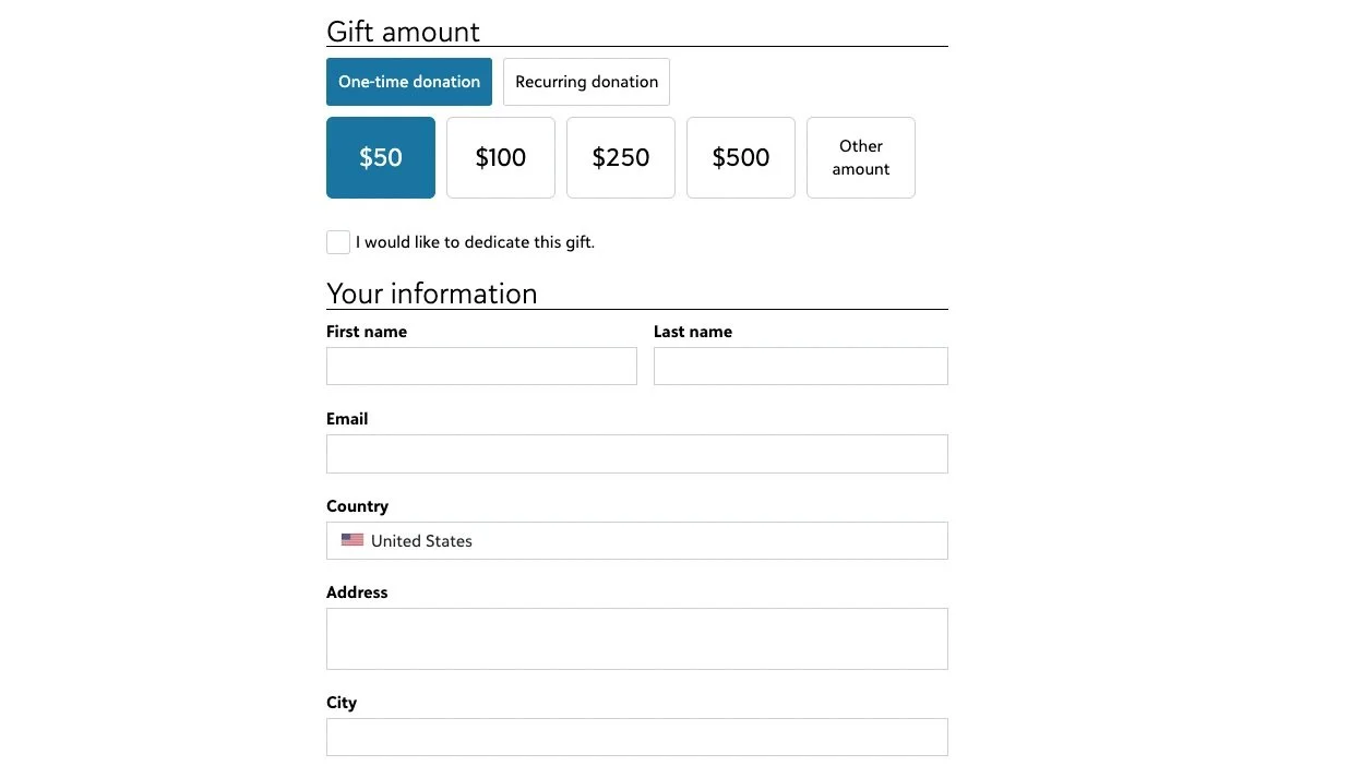
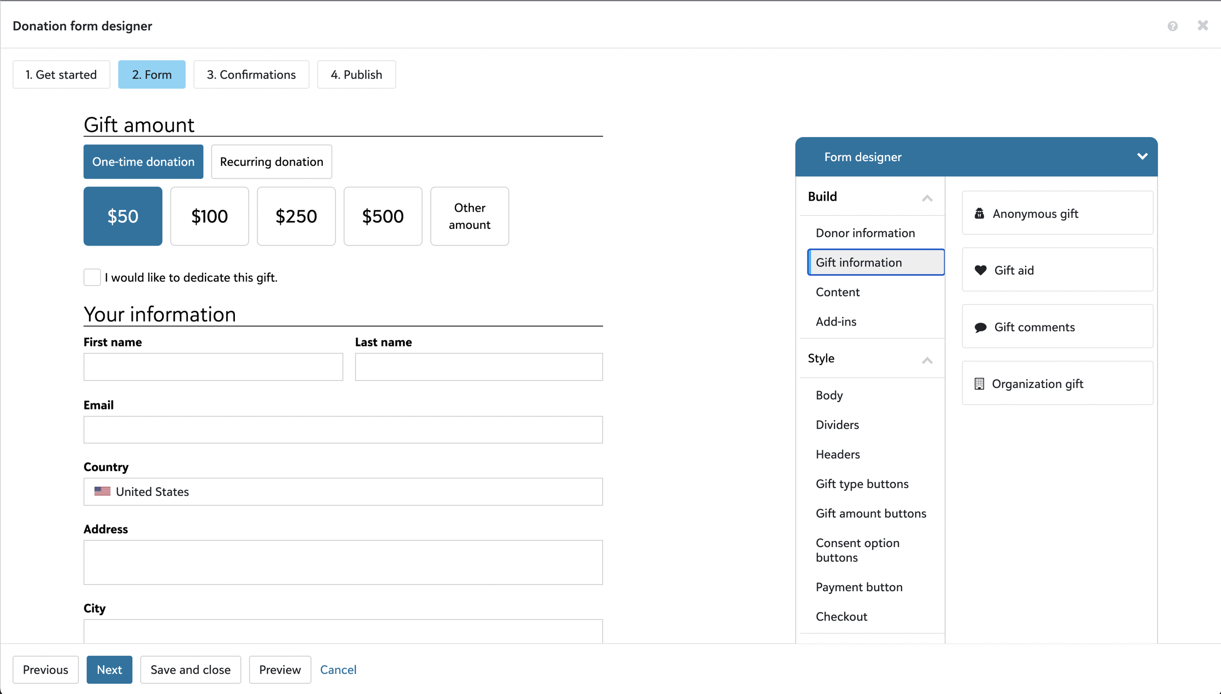
Having tributes on a donation form is a way for people to make a gift “in honor of” or “in memory of” someone or even something important to them. Many nonprofit organizations want this feature when they create their donation forms, as donors expect to be able to give a gift in tribute when needed. For some organizations, this is a large source of revenue.
Challenge
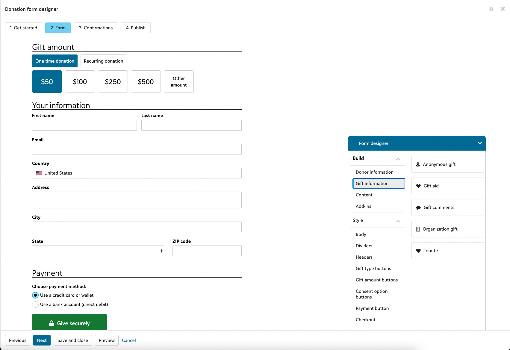
Many of our customers were not adopting our newer online donation forms, choosing to use an outdated form designer, which uses old technology that can’t handle the volume of donations during events like Giving Tuesday. One of the biggest reasons for not adopting is because Tributes is not available.
My Role
I was the designer of this feature from the initial design phase to its release. It went through many iterations and priority changes before reaching a final design that was built and released.
Results
When Tributes was released on July 12, 2022, people immediately started using it. By October 27, 2022, 3416 forms have Tributes on it, making about $1.4M in donations, with a 3% increase in adoption.
The Process
The Beginning
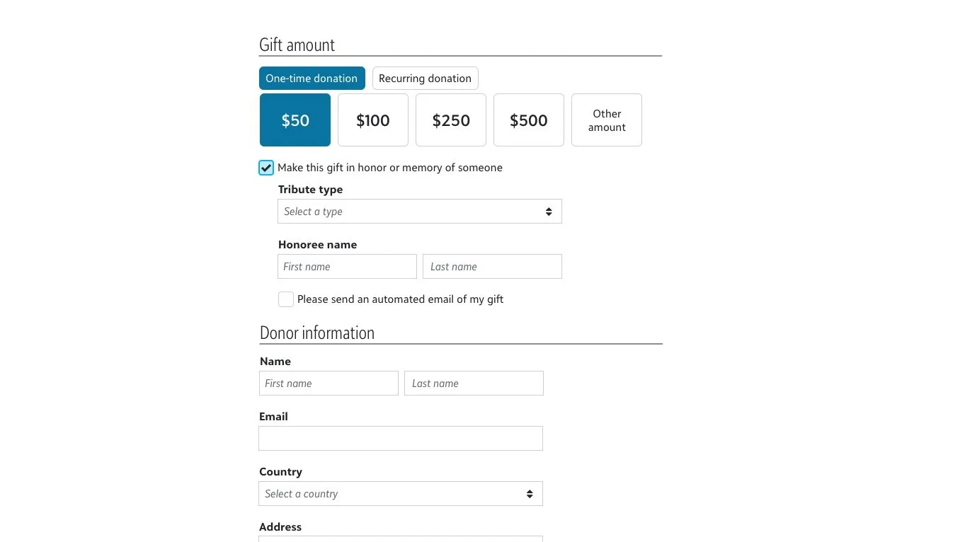
Initially, we were to design Tributes for the existing fundraising platform so were constrained by the limitations of the existing software. We went the route of using many of the elements similar to the outdated form designer as data had to be a certain way to be able to fit into the old database.
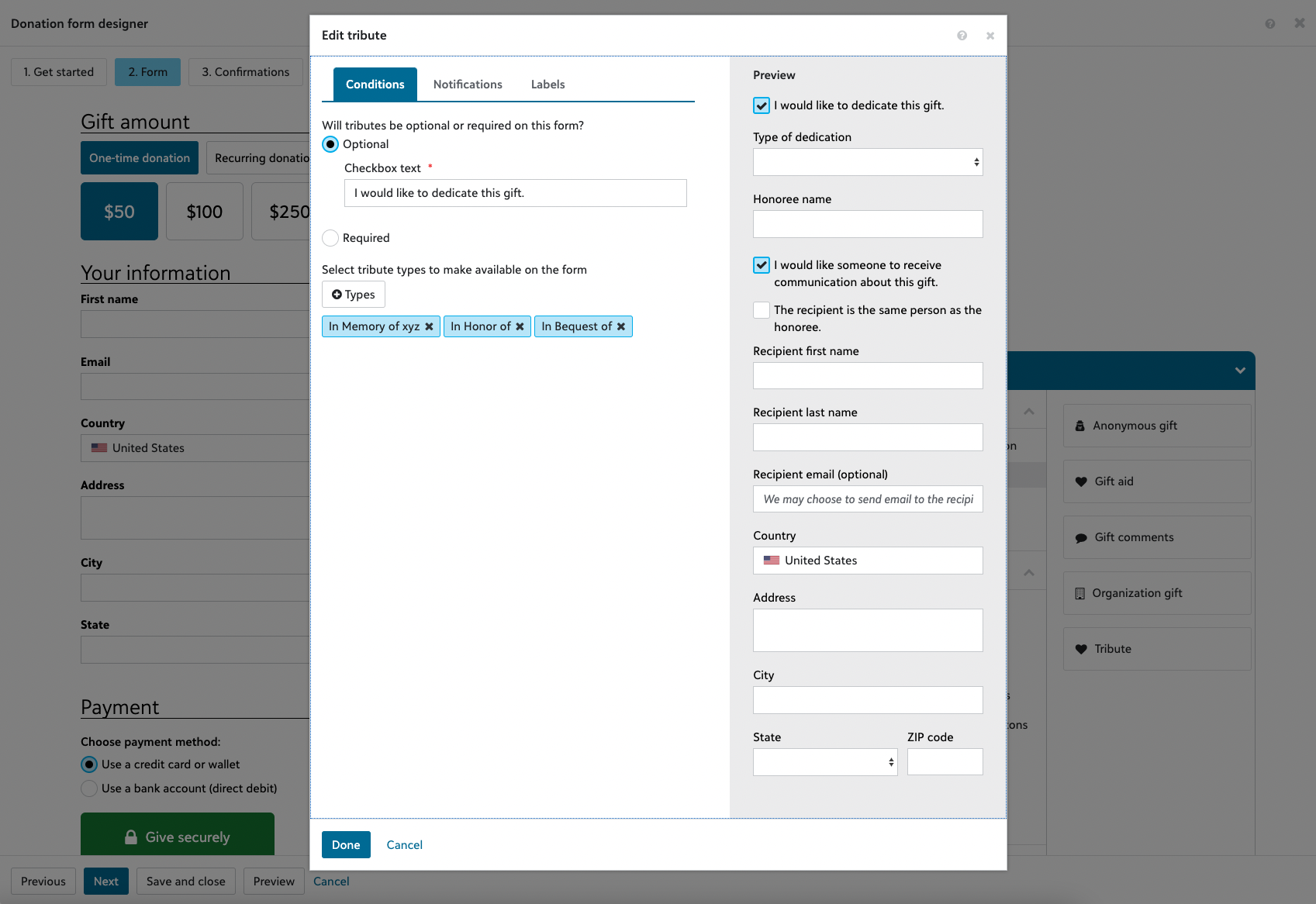
An example of this is that the honoree name had to be separated into “First name” and “Last name”.
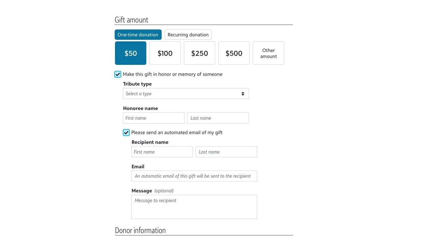
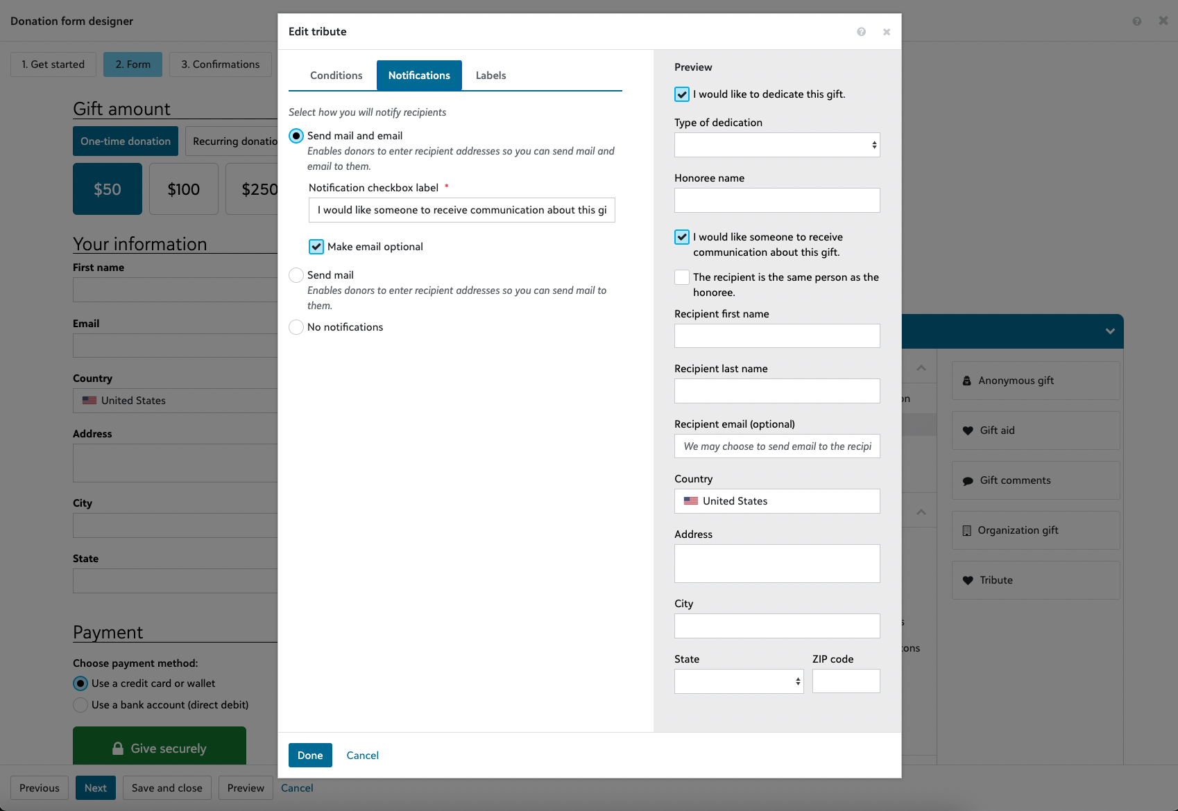
We also wanted to play with the idea of being able to send automated tribute notification emails, something not available in the outdated donation form.
Discovery
As our timeline was short, I decided to do some quick usability testing around the office as many of our colleagues have made donations at least once.
Key Takeaways
It took too long for people to understand what sending an automated email of my gift checkbox would do. Many didn’t understand until they checked the box.
Some people were still confused about what this automated email does. It is for notifying someone that a tribute gift has been made but some thought it is the email for the donor.
There was not always an immediate connection that the email under “Recipient name” is for the recipient of the tribute notification. If the participant is not used to our donation forms, there was confusion if that is for the donor or not.
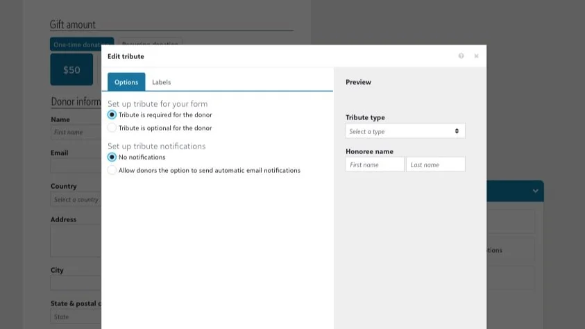
In the back office donation form setup, we found that people understood better what they were setting up with radio buttons showing all the choices as opposed to just a checkbox turning things on and off.
Opportunity for More Exploration
Eventually, an initiative was started to build a new cloud platform with a new modern design system where fundraising and financials could be in one place (they are currently in different products). This lifted a lot of our prior software constraints and gave us more time to be able to design more freely and creatively.
As we were not rushed this time around, I made the time to look at exemplars of different nonprofits’ tribute forms.
Key Takeaways
Many forms use natural language in explanations and in how they lay out their text boxes.
Instead of short labels as is prone in the back office, many of the forms are not afraid of adding descriptive explanations for donors who are unfamiliar with the system.
Iterations
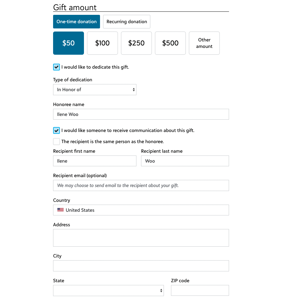
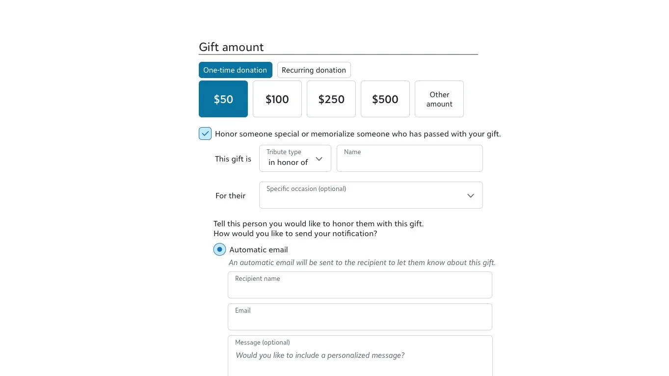
I started redesigning our tribute forms with the exemplars’ takeaways in mind. I wanted to be more descriptive with what choices are available to the donor and use more natural language.
We were no longer constrained to a First name and Last name fields. We have people who have mentioned they would want to make tributes not only to people but also to “my dog Spot” or “all the dolphin of the sea”.
The tribute notifications area went through the most iterations as that was the most complex area. We needed to make that area easy to understand for donors but also fit ever-changing technical requirements.
We played around with the idea that the donation form should be more donor-centric in that it is where the donor is telling the organization that they want a notification sent, not the organization collecting information so they can send what they, as an organization, want to send. What the organization wants to send will be managed in the Tributes management area.
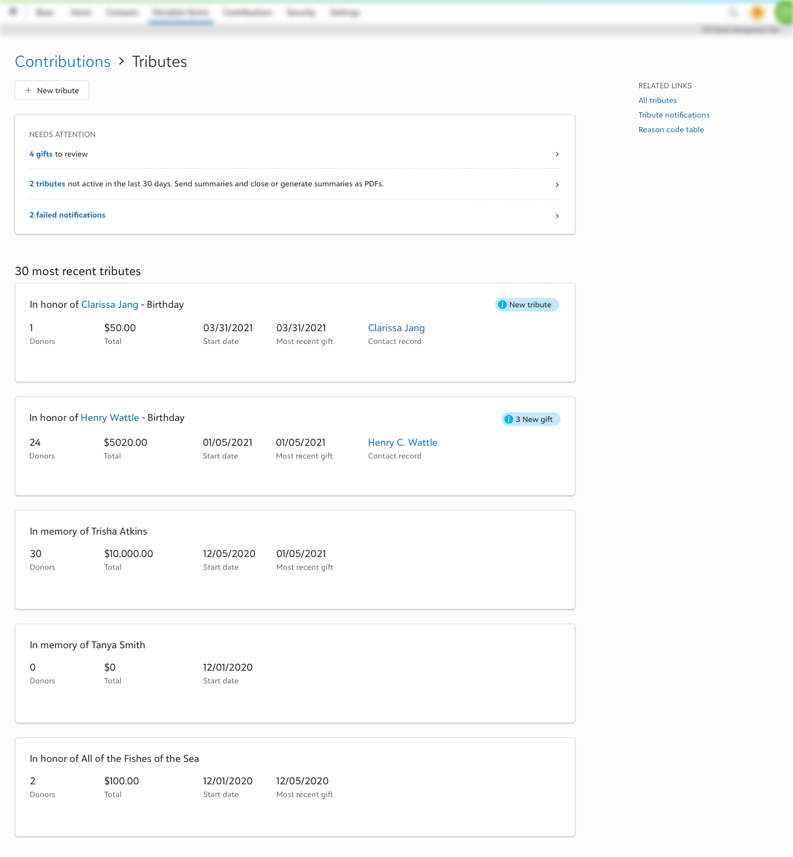
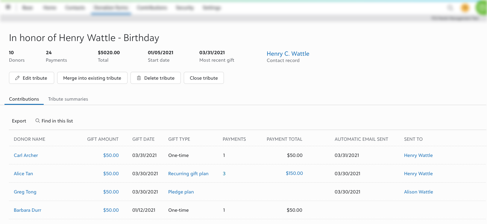
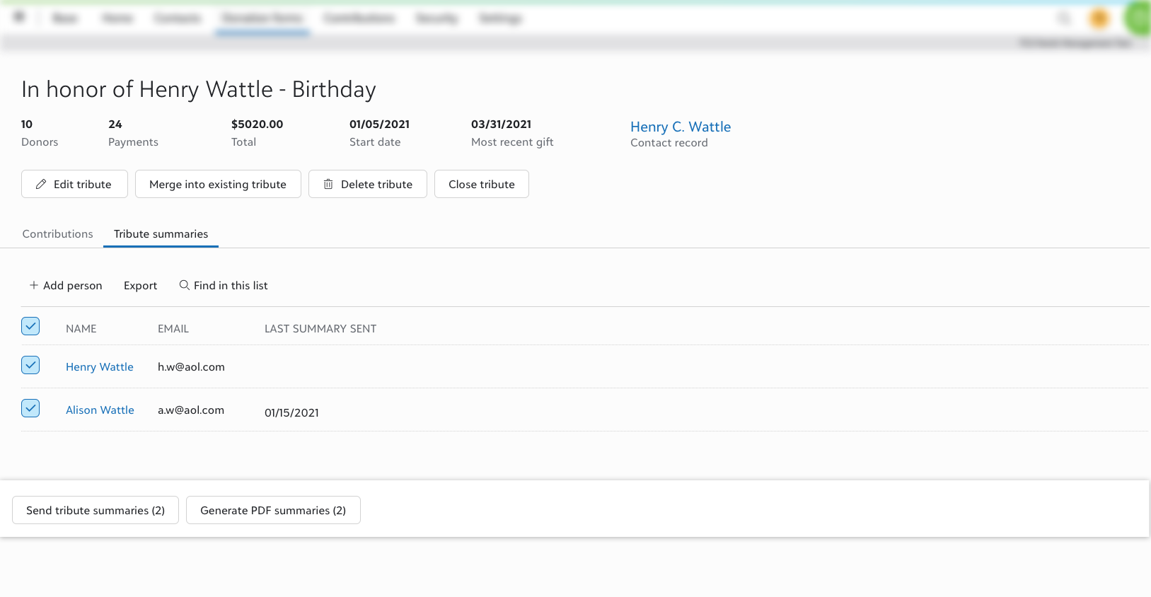
We were able to be more flexible in the design of the form because the back office was to be built from scratch. We were able to look into having a Tributes management area. Here we can do some automatic matching of donors who are making the same Tribute and allow admins greater control over how they manage the information.
Key Takeaway
We were able to do some discovery sessions with these iterations and have found that people had an easier time understanding what is going on to be able to pick the options they want.
The Final Design
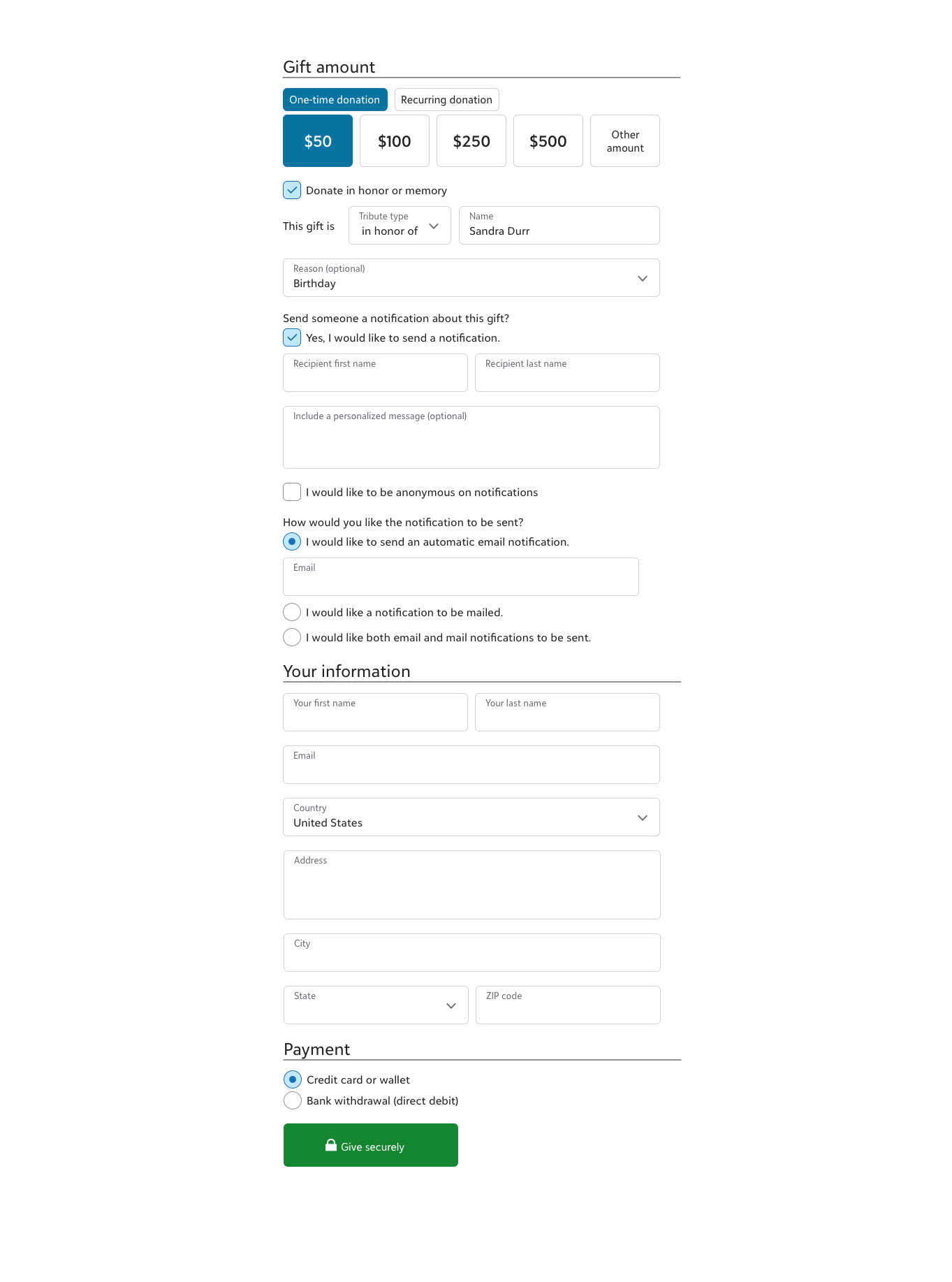
Ultimately, the decision was made that it’s a priority again to have Tributes built for our existing online donation form platform as we already have customers there and we wanted more people to adopt.
We were back to our old constraints and had to scale back in certain areas like the notifications area with no automated email but because we had the time to explore and see how people reacted to those ideas, the team was more willing to incorporate elements that will make the form and form setup easy to use.
It wasn’t without some conflict. We had to choose to have the donation form easy to use for the donor or have the data fit better in the back office system. I kept the stance that the donation form needs to stay intuitive for the donor. If we make them fill out information they don’t understand why they need to fill out, then they are going to abandon the form and not give a donation. I persuaded my PM to continue to make it easier for the donors as most admins are used to the complexities of the back office system.
Customer Feedback
When Tributes was built and before we released to everyone July 12, 2022, we held a program with about 10 – 15 admins for a few weeks for them to use the feature and give their feedback so we could fix any big issues.
Key Takeaways
The Tributes donation form setup and donation form were intuitive and easy to use. They had no issues with it.
One admin created a form before our first meeting when he saw the feature was available.
They wanted the Tributes functionality enough that they were willing to work around the back office data difficulties.
